Browser-Based Software Design
The Client
Work From Roam (WFR) is a free platform that helps users find a remote place to conduct business in their current area. Offering search and filtering capabilities of each user’s specific tastes and mandates for doing business, the platform provides detailed venue information along with corresponding GPS capabilities to help a user get there. WFR differentiates itself from Google, Apple, and Yahoo Maps by focusing specifically on a worker’s priorities while working remotely.
The Brief
Work From Roam’s goal is to create a prototype, based on research and testing, that encompasses the full pipeline of design methodologies and strategy. WFR wants to first understand its users: who they are, what they prioritize in a workspace, and how they interact using various interfaces. This research will then be used to create low to high-fidelity wireframes that will be tested and prepped for a controlled alpha release. The UX work be an ongoing assignment that will require routine meetings with both WFR’s stakeholders and developers.
Timeline: Winter/Spring 2020
Our Team / My Role
WFR’s team consisted of (4) UX team members with varying strengths and abilities. Our complementary skillsets proved to be an asset towards meeting our goals as a unit.
My responsibilities included:
Research: As the lead researcher on the team, I conducted and led interviews, helped define the problem/solution, created personas and a user journey, and synthesized our research.
Design: Using the team’s mobile design as an aesthetic North Star, I took the lead on conforming the user’s experience into high-fidelity wireframes for a user’s desktop interface.
Together, our entire team would conduct usability tests and collaborate on revisions for both mobile and desktop designs.

My Work From Roam teammates
Research: Interviews
In our efforts to fully define the user, problem, and solution, we conducted interviews. Subjects each had history of working from home and/or remote areas.
My question topics included:
What is your experience with finding remote workspaces?
What is important to you, as a worker, when it comes to your remote workspace?
What are some things you value when looking for a workspace?
What are the advantages you find by working remotely?
What are some of the deterrents when it comes to your workspace?
Tell me your process in looking for a space to do work (outside of the office/living space)?
How important are comments or photos to you when finding a work space?

“For me, I need a place to work that allows me do just that: work. Getting distracted comes too easy.”
— Actual User Quote
Research: Affinity Mapping
Compiling data from our interview, we took to affinity mapping so we could find what mattered most to our users. These were the common characteristics of what our users valued most in a workspace:
Ambience
Architecture
Bathroom
(How) Busy
Capacity
Cleanliness
Cost
Distance
Internet Speed
Refreshments
Time Limit
Research: The Problem & Solution
Through user research interviews and data synthesization, we were able to define the problem and offer a solution.
Research: Personas
Once we solidified the problem and solution, I wrote two personas that helped us prep for design.
Larry The Local - As a city local, Larry is motivated to find venues that make it easy: be it those that are close, those that aren’t too loud, those that meet his needs in terms of easy (free!) WiFi and bathroom access, a place to grab a quick bite on the job, and spaces in which he can invite in fellow collaborators for various meetings and presentations.
Tara The Traveler - As a visitor, Tara values safety above all. She’s excited to explore new areas and even meet new people, but needs the confidence in order to do so. In addition, she’s very in tune with her priorities when it comes to her space, giving her an almost-expert view of what’s possible.
Ideation: Drafting
While this particular mockup (seen on left) didn’t require pen and paper to make, I still consider it a sketch due to its rapid-fire creation. This drawing in particular helped me onboard to Figma as a first-time user, and gave me something to show my UX colleagues for consideration.
When drafting a design aesthetic, I tried to address on a few key areas:
I wanted to make filters stand front and center, and drafted a few different ways how users could enter pertinent information and preferences for search.
Don’t broke what isn’t fix — the map may look familiar to what’s already on the market, but that was a deliberate decision to not completely rewrite how users are conditioned to interacting with other GPS platforms. A mix of old and new will both encourage users looking for something novel, while being kind to others who are less adept to change.
“Good call on making filters front and center.”
— Team feedback on sketches
“I like how this tows a line between fresh and familiarity.”
— Team feedback on sketches
Ideation: Customer Journey
Using research, and speaking to to the team, I built a Customer Journey that predicted the user’s experience while using Work From Roam.
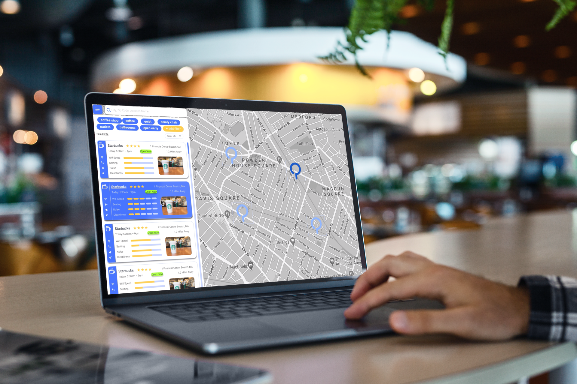
Ideation: Wireframes
Once we reached a team consensus on user flows, I elected to be the one to primarily focus on the desktop interface. This process required to stay true to the look our evolving WFR mobile design, while at the same time negotiating the ways users prefer to see/use the platform while at a stationary computer or laptop.
A sample of my wireframe work
Usability Tests: Writing & Rating
Once wireframes were complete, we underwent (7) testing rounds in order to reveal potential usability problems.
Insights:
There were a number of places where we needed to either establish better copy strategies. From providing instructions, to clarifying prompts, users cited multiple instances where language could help the platform’s general navigation.
Our rating system was confusing to some users, and the way we were presenting data created more questions than we initially envisioned (ex. “what does noise actually mean?”). This needed to be better clarified to become a true value to users.
Usability Tests: Pins & Maps
Insights:
Pin points needed to be enlarged, so users could adequately make them out.
Users found the UI relied on too much blue, which some found off-putting to the eyes.
Credit to Pat Foley, who took the lead the above logo design while we tested it with our broader team
Additional: Branding Tests
As no style-guide had yet been established, we conducted testing to try our branding possibilities. This included…
Logo evolution. From unique pins to roaming bison, we best tried to capture a unique and playful aesthetic that worked with Work From Roam brand name, and would register as fun and novel for a consumer.
We developed ideas for personal avatars to run by stakeholders — this continues to be a work-in-progress.
Prototype
Having made adjustments thanks to usability testing, we were prepared to present our work to developers.
Prototype: Demo 1
Here we demonstrate how users can filter and find a remote workplace, and give it a rating.
Prototype: Demo 2
Next, we demonstrate how users can navigate their profile.
Working With Developers
After multiple rounds of testing, we worked with WFR’s team of developers in handing off our designs.
Alpha Release
The UX team worked closely with the development team as we transitioned from a Figma protoype to a hard-coded model.
We unveiled an Alpha release in June 2020. The link can be found here.
Next Steps
The UX team tested the Alpha release, which picked out a limited number of bugs and technical errors. We took that feedback to the Developers as we moved into Beta phase.
The WFR teams continue to develop this product, slated for 2021 launch.