Building an E-commerce Store
The Client
Video stores are a yesterday business.
No surprise there. We're deep enough into the millennium - not to mention experiencing the dominant reign of places like Netflix, Amazon, Hulu, and others - where a favorite past time of Americans is, well, quite past its time.
However, there are a few institutions still standing. Many of those who have found purpose in being a sort of analogue archive; preserving titles that are subject to licensing blackouts or never made the conversion to digital. And with that cue, welcome Video Opus.
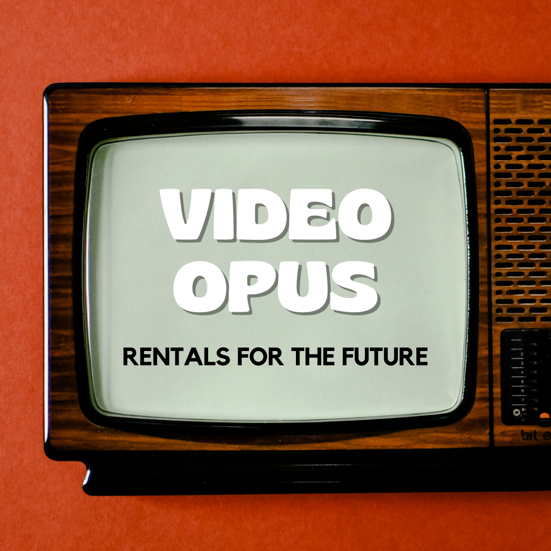
The Brief (Demo)
Take Video Opus into the new millennium by building an e-commerce experience where users can browse, select and rent the enormous library which has, until this point, never moved into the digital realm.
To execute on the project, I would need to research competitors, conduct qualitative interviews, do card sorting, iterate on various designs options, and undergo several usability tests.
Timeline: Two (2) Weeks
Research
Kicking off the project, I first needed to define the problem, establish an information hierarchy, analyze the competition, and determine the user.
Research: Interviews
During the discovery phase of my process, I conducted (5) user interviews of customers in order to gain a better understanding of their process while shopping off and online (streamers). To do this, I recruited consumers who had current or recent knowledge of the video store experience, many of whom identify as members of the client.
I wanted to understand:
What users like/dislike (and in some cases, remember) about the video store experience.
What users like/dislike about the current fleet of streamers.
How users navigate finding a title both on and offline.
Thoughts on a user's payment process.

“I miss the video store experience. In my opinion, it needed to evolve not disappear completely. ”
— Actual Interview Quote
Affinity Mapping helped to synthesize the interview data
Research: Affinity Mapping
Once I had conducted the interviews, I took to Affinity Mapping to help synthesize the data and create actionable objectives in which to build an e-commerce market.
Key takeaways:
Users miss the video store experience, noting it was often easier to find what titles they wanted along with providing relevant information (box description, etc).
Users stated how much they value box artwork, and wish that were implemented into the current digital shopping experience.
Users were split on whether they enjoyed the current categorization methods found on streamers such as Netflix/Amazon/Hulu.
And finally, the number one reason users choose specific titles is because of (friends/family) word of mouth.
Research: The Problem & Solution
Through a combination of user research and understanding the brand, the problem was quick to emerge. I wanted to create an e-commerce market for the client which would help not only impact sales but increase its overall relevancy for the customer.

Card Sorting Phase #1 - Letting a user construct categories from scratch

Card Sorting Phase #2 - Setting parameters to achieve a more detailed consensus
Research: Card Sorting
In order to properly build an e-commerce store, understanding the information architecture is paramount. With this in mind, I prioritized two things:
1). I needed to have a solid idea of the client’s inventory.
2). I needed to understand how users made sense of that inventory.
Using 100 cards with 100 unique titles, I went through three rounds of card sorting, including:
Phase One: Open Sort
I began with an Open Sort, where I began to understand users unfiltered thoughts about how they would categorize various titles. [3 participants]
Phase Two: Closed Sort
Based on the Open Sort, I conducted a Closed Sort where I could establish guard rails to better define the categories. [3 participants]
Phase Three: Tagging Exercise
Once I established the categories, I underwent a Title Tagging session so that necessary titles could be found in more than one place. [2 participants]
From this process, the categories that emerged included:
American Indepent
Documentary
Drama
Genre Fiction
Golden Age
Family/Animation
Foreign
Musicals
New Hollywood
Westerns
Research: Competitive Analysis
In order to create an ideal e-commerce experience, it was essential to study the current leaders in the field. Knowing this, I opted to do both a comprehensive competitive and heuristics analysis of Netflix, Amazon, and Hulu.
Key Takeaways:
The streamers did a lot of things right. They were all easy to access, explore, and came with features such as trailer and descriptions.
That being said however, none were perfect: Hulu's taxonomy was confusing, Amazon's entire shopping process takes much longer than any of its competitors, while Netflix can be disruptive and aggressive in terms of interface and features.
A heuristics analysis of popular streamers
“Martin”served as the north star when moving to visual design
Research: Personas
Using both a combination of interviews/card sorting, I created a persona that helped as a guide as I prepped for iteration.
Martin The Movie Buff - is a devout fan of the video store experience.
Martin was created with the client in mind and with a complete realized view of who their consumer is.
To Martin, word-of-mouth recommendations and customer reviews are a key motivator to shopping.
Martin likes the video store experience, especially the box art and synopsis.
Martin is interested in a fast and easy checkout process.
Ideation
Now that research was complete, it was time to move onto ideation. During this phase I began with sketching and eventually graduated into wireframes.
Ideation: Sketching
Armed with paper and a Sharpie, I was able to ideate on a visual approach that best tackled the problem.
Key takeaways:
Client consideration:
I aimed to be cognizant of the brand/client, so I decided to blend an old-school (‘90s) aesthetic with a contemporary interface found in today’s streamer market. It remained important to make this a fun and visual experience for the user.
[Figure A]
User consideration:
I wanted to adapt what users loved about the video store (the artwork, the descriptions), and made sure that could be realized digitally. [Figure B]
Given word of mouth was so revered to the user, I was especially excited to incorporate opportunities to include a "light" social media component where users could post reviews on their profile and connect to friends. [Figures C&D]
Preliminary sketches of the video store experience
“No trouble with navigating.”
— User feedback on sketches
“Try simplifying the icons a bit. ”
— User feedback on sketches
With some practice, I was able to build up to mid-fidelity wireframes
Ideation: Wireframes
After some quick sketching and feedback, it was time to conform sketches into prototypes using Axure.
Key Takeaways:
This was my first time using Axure, and admittedly there was a bit of a learning curve.
I seemed to quickly get the hang of the more practical design elements, but took longer to realize the interactions.
Bringing in higher fidelity images to Axure helped things come alive.
Usability Testing: Prototype
Key Takeaways from Participant 1[of2]:
Navigation was successful. Users had no issue with orientation and progress.
User, citing privacy, asked that there be an option to whether they wanted to make their viewing habits public or to keep private.
Here is a button I made available so users could consent to sharing

Implementing the site search icon to a place of familiarity
Usability Testing: Prototype
Key Takeaways from Participant 2[of2]:
User felt navigation was intuitive and somewhat reminiscent of a modern streamer.
User wanted a site-wide search menu, given Video Opus brand extends to events and postings.
Prototype
Having made adjustments thanks to usability testing, I prepared to present my work.
Prototype: Demo 1
This is a demo of what it would be like to select a movie, engage with its information, add to cart, and then return to browsing.
select rent -> select genre -> select title -> add to cart
select title -> see friend’s reviews -> check-out -> make rental public
Prototype: Demo 2
This is a demo of what it would be like to look at a film, engage with friend’s reviews, exit via the checkout process, and end by posting the rental to one’s profile.
Takeaways
My effort to create an e-commerce experience generated mostly positive feedback. That being said, there are some factors I would try and improve for future versions.
Things that worked
People responded well to keeping the client in mind, and trying for an old/new school hybrid aesthetic.
I received positive feedback on my attempt at introducing a social component to the store.
I was able to successfully show how the customer could easily use an e-commerce site via the rental and checkout process.
Things to look at in V2
Upon feedback, there may still be room to further clarify logos and site taxonomy.
Would love to further develop the “social media” component.